Most design systems fail for one of two reasons. Either they are built by designers who do not understand implementation constraints, or they are built by developers without enough design input. The result is a system that no one actually uses.
We build design systems as a collaboration between design intent and implementation reality. Every component is designed with its development constraints in mind. Token naming follows implementation-ready conventions. Documentation explains not just what the component looks like, but when to use it and when not to.
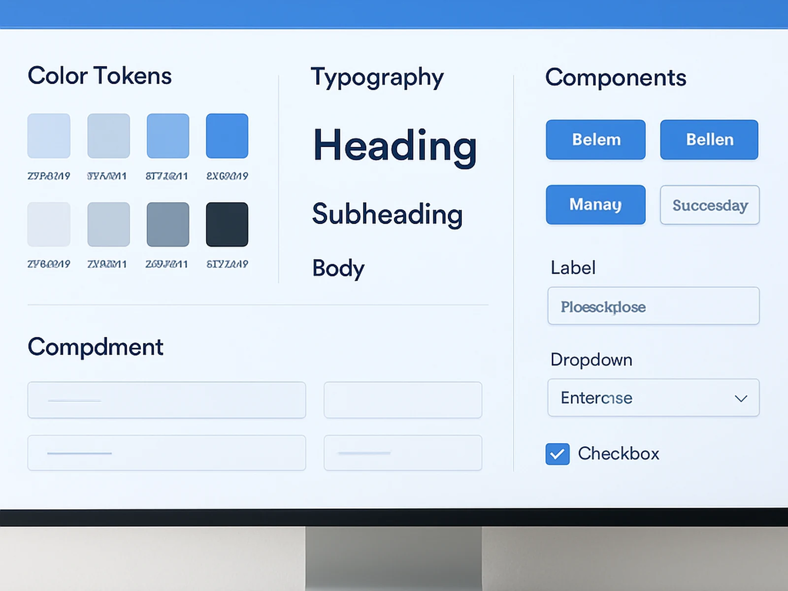
The Figma library is built with strict variant naming, auto-layout throughout, and component nesting that maps cleanly to the component hierarchy a developer would create. The design file is not just a reference, it is a working tool.
A design system is not a one-time deliverable. We build in the governance layer: a contribution guide, a versioning approach, and documentation on how to add new components that stay consistent with the established system. The system can outlast our involvement.
What is included
Delivery: Delivered via Figma library and documentation site or PDF. Design system projects run 8-12 weeks, confirmed at kick-off.
From this service
Design system cut component design time from days to hours. Development team ships new features without design review bottleneck.
Unified design system across web app and marketing site. First time both surfaces matched. Reduced QA bugs by 60%.
Common questions
We can extend an existing system (Material, Radix, etc.) or build from scratch depending on your constraints.
Your team does, with our documentation. We include a contribution guide so new components can be added consistently.
No. A focused 30-component system is appropriate for most growing products. We scale the scope to the product stage.